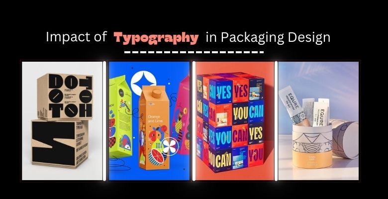
Typography is a fundamental aspect of packaging design, impacting how a product is perceived and how effectively it communicates a brand’s message. Whether you’re choosing fonts for product labels, designing high-end packaging, or exploring free fonts for packaging design, understanding typography principles can elevate your brand’s impact. This guide will dive into typography packaging design, including key principles, popular fonts, and practical ideas for creating eye-catching packaging.
What is Typography in Packaging Design?
Typography in packaging design refers to the strategic use of fonts, text layout, and type style to create visually appealing and communicative packaging. It involves selecting fonts that reflect the brand’s personality, emphasize key product details, and enhance the overall aesthetic of the package. Good typography not only makes a product stand out on the shelf but also builds brand identity by conveying messages like luxury, playfulness, or sustainability.
13 Best Typography Packaging Design Ideas
Typography offers endless possibilities for creative expression in packaging. Here are some of the best typography packaging design ideas that can help your product grab attention:
- Bold Fonts for Impact: Use large, bold fonts to highlight the brand name or main message.
- Minimalist Typography: Simple fonts with ample white space can create a clean, sophisticated look.
- Handwritten Fonts for Authenticity: Handwritten or script fonts convey a sense of warmth and personal touch, ideal for artisanal or organic products.
- Vintage-Inspired Typography: Retro fonts can evoke nostalgia, giving products a timeless, classic appeal.
- Geometric Fonts for Modern Brands: Clean lines and structured fonts give a contemporary feel, perfect for tech or minimalist brands.
- Bold Contrast: Combine contrasting fonts (e.g., serif with sans-serif) to create hierarchy and guide the viewer’s eye.
- Play with Colorful Text: Using bright, eye-catching colors can enhance the text’s impact, especially for youthful or playful brands.
- Layered Text: Overlay text on top of graphics or images for depth and texture.
- Transparent Typography: Allowing the packaging background to show through letters can create an innovative, modern aesthetic.
- Text as a Visual Element: Use text creatively to form shapes or patterns that double as a visual element on the package.
- Outline Text for Depth: Outlined fonts give a 3D effect, drawing more focus to the brand name or product type.
- Typography and Texture Integration: Pair typography with textured packaging materials like matte or gloss for tactile appeal.
- Eco-Friendly Typography: For sustainable brands, earthy fonts in green, brown, or beige can reinforce the eco-conscious message.
These ideas provide a foundation to experiment with typography and tailor it to your brand’s identity.
The Four Rules of Typography in Packaging Design
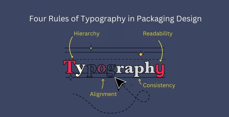
Understanding the core rules of typography is crucial for effective design. Here are four essential rules to consider:
- Hierarchy: Typography should guide the viewer’s eye. Primary information, like the brand name or product type, should be bold and prominent, while secondary details are smaller or lighter.
- Readability: Fonts should be easy to read at a glance, especially for key information like product name, ingredients, or instructions. Avoid overly decorative fonts that could compromise readability.
- Consistency: Use a consistent typography style across all packaging elements to reinforce brand identity. Limit font variations to create a cohesive look and avoid clutter.
- Alignment and Spacing: Proper alignment and adequate spacing between letters, words, and lines contribute to a clean, professional appearance. Kerning, tracking, and leading should be adjusted to improve clarity.
Popular Fonts Used in Packaging Design
Choosing the right font is crucial in typography packaging design. Here are some popular font types and examples of their ideal usage:
- Sans-Serif Fonts (e.g., Helvetica, Arial): Modern and clean, suitable for minimalist or tech-oriented brands.
- Serif Fonts (e.g., Times New Roman, Georgia): Traditional and elegant, often used by luxury or heritage brands.
- Script Fonts (e.g., Pacifico, Great Vibes): Evoke a sense of personality and warmth, great for artisanal products.
- Slab Serif Fonts (e.g., Rockwell, Courier): Strong and bold, often used to create a vintage or rustic vibe.
- Custom Fonts: Many brands create custom fonts to establish a unique brand identity, ideal for larger businesses with the resources to invest in custom typography.
Selecting the right font based on your brand’s personality and product type will set the tone for your packaging.
Do Graphic Designers Do Packaging Design?
Yes, graphic designers often specialize in or offer packaging design services. Packaging design involves combining branding, typography, illustration, and layout skills to create packaging that attracts customers and communicates a product’s value. Many designers work with businesses to create custom typography and visual elements that make the product unique and engaging.
Typography Packaging Design Examples
Real-world examples offer inspiration and insight into how typography can transform packaging. Here are a few notable examples:
- Apple’s Product Boxes: Known for minimalist sans-serif fonts and precise layout, Apple’s packaging is synonymous with elegance and sophistication.
- Oatly’s Quirky Packaging: Using hand-drawn fonts and casual text placement, Oatly conveys a fun, approachable personality.
- Aesop’s Skincare Packaging: With classic serif fonts and monochrome colors, Aesop’s typography gives a luxurious and timeless feel.
- Innocent Smoothies: Known for friendly fonts and playful typography, Innocent’s packaging reflects the brand’s youthful and approachable nature.
These examples demonstrate how different typography styles can align with and enhance brand identity.
Read Also: Comprehensive Packaging Strategies for Small Businesses
Typography Packaging Design Free Resources
For businesses or designers seeking typography resources without a significant investment, here are some free resources:
- Google Fonts: A free library of open-source fonts suitable for both commercial and personal use.
- Font Squirrel: Offers high-quality, commercial-use fonts for free download.
- DaFont: Provides a wide range of fonts, including decorative and script fonts, which can be used for packaging design.
- Canva: Has numerous free fonts and templates, allowing users to experiment with typography layouts.
These resources provide valuable tools for creating impactful typography in packaging design without the need for expensive software.
Free Fonts for Packaging Design
Using free fonts can be an economical and creative way to enhance packaging design. Here are some highly rated free fonts for packaging:
- Montserrat: Modern and clean, ideal for minimalist packaging.
- Playfair Display: Elegant serif font, suitable for premium or luxury packaging.
- Pacifico: A playful script font, great for casual or artisanal brands.
- Lobster: Bold and friendly, often used for food and beverage packaging.
- Raleway: Sleek and versatile, perfect for both product labels and brand names.
These fonts can be downloaded from free font resources and incorporated into design software to create a polished, professional look.
Read More: Mastering Packaging Design Software: 12 Best Tools
What are the Different Branding Principles in Typography Packaging Design?
Effective branding in typography packaging design revolves around several principles:
- Consistency: Maintaining the same fonts and typographic style across products reinforces brand recognition and trust.
- Adaptability: Typography should be flexible enough to work across various packaging sizes and formats without losing clarity.
- Alignment with Brand Personality: The font choice should reflect the brand’s personality – bold and modern for tech products, elegant for luxury, or playful for children’s products.
- Emotionally Engaging: Typography should evoke the desired emotional response from the customer, whether it’s excitement, nostalgia, or confidence.
Applying these principles ensures that typography in packaging is not only visually appealing but also reinforces the brand’s core values.
FAQs on Typography in Packaging Design
- Why is typography important in packaging design?
Typography is crucial because it shapes the first impression a customer has of a product. Well-chosen typography enhances readability, reflects brand personality, and creates a memorable visual identity. - Can I use free fonts for my packaging design?
Yes, many free fonts are available for commercial use. Be sure to check the font license, as some free fonts are only for personal use, while others are suitable for commercial projects. - What is the most popular font for luxury packaging?
Serif fonts, such as Times New Roman or Playfair Display, are often popular in luxury packaging as they convey sophistication and timelessness. - How do I choose the right font for my product’s packaging?
Consider your brand’s personality, the product’s purpose, and your target audience. Choose fonts that are easy to read and align with the emotional tone you want to set. - Can typography alone make my packaging stand out?
Yes, typography can be a powerful design element. With the right font choices, layout, and color combinations, typography alone can create a striking and memorable packaging design.
Conclusion
Typography is a key element in packaging design, capable of transforming a product’s visual appeal and communicating the brand’s essence. From selecting the right fonts to applying effective typographic principles, typography can make a product stand out, convey important information, and create an emotional connection with consumers.
By leveraging the typography ideas, principles, and free resources discussed here, you can develop a unique and impactful packaging design that aligns with your brand’s identity. Get in touch with 99 designs packaging for more interesting insights.
